
Hi!
Seeing your other (Grapher charting engine) post I wanted to look at it and it looks interesting. :)
However I've encountered weird behavior - maybe because I'm not using in correctly.
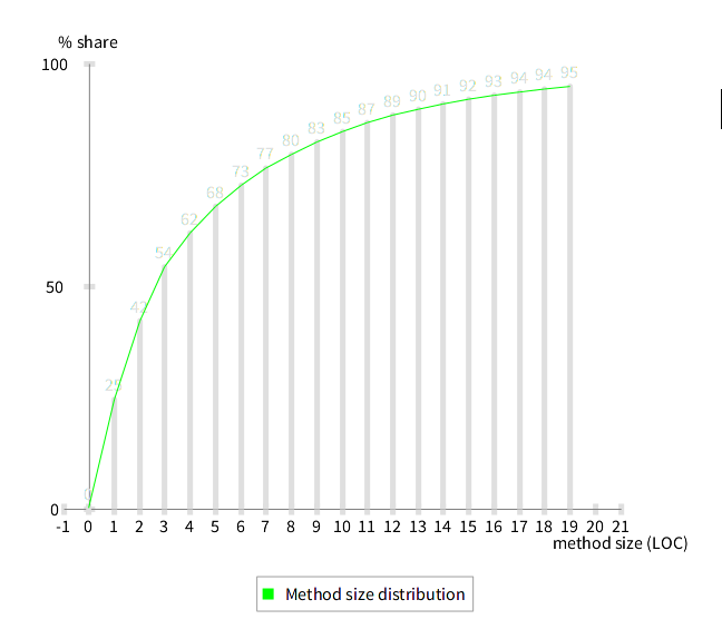
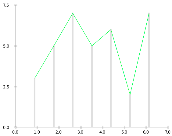
When you look at the bar chars they do not line up with the tick numbers at bottom.
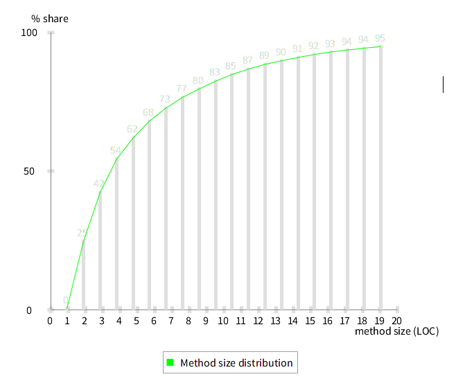
I have explicitly specified number of ticks (20). Interestingly if I change it (to 30) then it lines up but is moved to left by one (starts at zero instead of one - just by changing numberOfTicks).
Here is the script I used to create it (the data is generated from another script) ================================ data := {1->0.3024011554432208. 2->24.359090088463624. 3->17.660001805380034. 4->12.111843293013179. 5->7.624345549738219. 6->5.985963170247337. 7->4.740250947824517. 8->3.837560931576097. 9->3.0691460552446292. 10->2.819777938256003. 11->2.3334536920021667. 12->1.9915598483480772. 13->1.6970572305470302. 14->1.3089005235602094. 15->1.1847806463260515. 16->1.0640458566528253. 17->0.8891496660046939. 18->0.7244087380393573. 19->0.670247337064452. 20->0.5878768730817837}.
y := [ :pair | (data select: [ :each | each key <= pair key ]) inject: 0 into: [:sum :item | sum + item value ]].
b := RTGrapher new. b extent: 500 @ 400.
ds := RTStackedDataSet new. ds points: data. ds x: #key. ds y: y. ds barShape. b add: ds.
ds2 := RTStackedDataSet new. ds2 points: data. ds2 x: #key. ds2 y: y. ds2 connectColor: Color green. ds2 highlightIf: [ :pair | true ] using: [ :pair | (y value: pair) roundTo: 1 ]. b add: ds2.
b axisX noDecimal; numberOfTicks: 20; "<- change to 30 to break it" title: 'method size (LOC)'. b axisY noDecimal; title: '% share'. b build.
lb := RTLegendBuilder new. lb view: b view. lb addColor: Color green text: 'Method size distribution'. lb build.
b view open. ================================
It's also amazing that 1/4 of all Pharo code is in two-line methods; that's including the method name. :)
Peter

Le 21 mars 2015 01:01, "Peter Uhnák" i.uhnak@gmail.com a écrit :
Hi!
Seeing your other (Grapher charting engine) post I wanted to look at it
and it looks interesting. :)
However I've encountered weird behavior - maybe because I'm not using in
correctly.
When you look at the bar chars they do not line up with the tick numbers
at bottom.
I have explicitly specified number of ticks (20). Interestingly if I
change it (to 30) then it lines up but is moved to left by one (starts at zero instead of one - just by changing numberOfTicks).
Here is the script I used to create it (the data is generated from
another script)
================================ data := {1->0.3024011554432208. 2->24.359090088463624.
3->17.660001805380034. 4->12.111843293013179. 5->7.624345549738219. 6->5.985963170247337. 7->4.740250947824517. 8->3.837560931576097. 9->3.0691460552446292. 10->2.819777938256003. 11->2.3334536920021667. 12->1.9915598483480772. 13->1.6970572305470302. 14->1.3089005235602094. 15->1.1847806463260515. 16->1.0640458566528253. 17->0.8891496660046939. 18->0.7244087380393573. 19->0.670247337064452. 20->0.5878768730817837}.
y := [ :pair | (data select: [ :each | each key <= pair key ]) inject: 0
into: [:sum :item | sum + item value ]].
b := RTGrapher new. b extent: 500 @ 400.
ds := RTStackedDataSet new. ds points: data. ds x: #key. ds y: y. ds barShape. b add: ds.
ds2 := RTStackedDataSet new. ds2 points: data. ds2 x: #key.
I think that a RTStackedDataset is not using x.
ds2 y: y. ds2 connectColor: Color green. ds2 highlightIf: [ :pair | true ] using: [ :pair | (y value: pair)
roundTo: 1 ].
b add: ds2.
b axisX noDecimal; numberOfTicks: 20; "<- change to 30 to break it"
Try number of labels instead.
title: 'method size (LOC)'. b axisY noDecimal; title: '% share'. b build.
lb := RTLegendBuilder new. lb view: b view. lb addColor: Color green text: 'Method size distribution'. lb build.
b view open.
It's also amazing that 1/4 of all Pharo code is in two-line methods;
that's including the method name. :)
Peter
Moose-dev mailing list Moose-dev@iam.unibe.ch https://www.iam.unibe.ch/mailman/listinfo/moose-dev

Hi!
You are using an histogram. I think I should disable having labels on the X-axis with histogram. Currently, you can have:
-=-=-=-=-=-=-=-=-=-=-=-=-=-=-= data := {1->0.3024011554432208. 2->24.359090088463624. 3->17.660001805380034. 4->12.111843293013179. 5->7.624345549738219. 6->5.985963170247337. 7->4.740250947824517. 8->3.837560931576097. 9->3.0691460552446292. 10->2.819777938256003. 11->2.3334536920021667. 12->1.9915598483480772. 13->1.6970572305470302. 14->1.3089005235602094. 15->1.1847806463260515. 16->1.0640458566528253. 17->0.8891496660046939. 18->0.7244087380393573. 19->0.670247337064452. 20->0.5878768730817837}.
y := [ :pair | (data select: [ :each | each key <= pair key ]) inject: 0 into: [:sum :item | sum + item value ]].
b := RTGrapher new. b extent: 500 @ 400.
ds := RTStackedDataSet new. ds points: data. ds histogramWithBarTitle: #key rotation: 0. ds y: y. ds barShape. ds highlightIf: [ :pair | true ] using: [ :pair | (y value: pair) roundTo: 1 ]. b add: ds.
ds := RTStackedDataSet new. ds connectColor: Color green. ds points: data. ds connectColor: Color green. ds y: y. b add: ds.
b axisX noLabel; noTick; title: 'method size (LOC)'. b axisY noDecimal; title: '% share'. b build.
lb := RTLegendBuilder new. lb view: b view. lb addColor: Color green text: 'Method size distribution'. lb build.
b view -=-=-=-=-=-=-=-=-=-=-=-=-=-=-=
No tick and no label on the X-axis. However, you titled bar in your stacked data set.
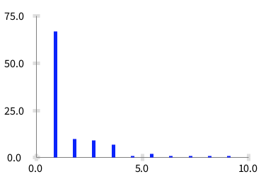
If you are working with distribution, I highly suggest you to work with RTDistribution. This class is far from being finished. But I need help on this. You can then do:
((CompiledMethod allInstances copyFrom: 1 to: 100) collect: #numberOfLinesOfCode) plotFrequency
Which produces something like:
So yes, most methods are very short :-)
Let us know how it goes
Cheers, Alexandre
Oh actually, I started to work on RTHistogram. But I did not finish. It would be great that you took over if you are working on distribution.
Cheers, Alexandre

I also already noticed that Barcharts currently do not use the index in the collections as x value, but a distribution over the x axis between (x-1) and x. This leads to misalignment when you compose two DataSets like this:
================================ data1 := #(3 5 7 5 6 2 7). data2 := Array with: 1 @ 3 with: 3 @ 5 with: 7 @2. ds1 := RTStackedDataSet new. ds1 points: data1. ds1 barShape. ds2 := RTDataSet new. ds2 connectColor: Roassal2.Color green. ds2 x: #x; y: #y. ds2 points: data2. b := RTGrapher new. b extent: 500 @ 400. b add: ds1. b add: ds2. b axisX numberOfTicks: 7; numberOfLabels: 7. b build. b view open ================================
As a rough bug fix I made another subclass RTBarChartDataSet that uses the real index. The following script just uses RTBarChartDataSet instead of RTStackedDataSet. Be aware that the fileout is from Visualworks, not Pharo.
================================ data1 := #(3 5 7 5 6 2 7). data2 := Array with: 1 @ 3 with: 3 @ 5 with: 7 @2.
ds1 := RTBarChartDataSet new. ds1 points: data1. ds1 barShape.
ds2 := RTDataSet new. ds2 connectColor: Roassal2.Color green. ds2 x: #x; y: #y. ds2 points: data2.
b := RTGrapher new. b extent: 500 @ 400. b add: ds1. b add: ds2.
b axisX numberOfTicks: 7; numberOfLabels: 7. b build.
b view open ================================
Now the points align. There are other issues however, e.g. the x axis currently stops at max value, but should be at least as wide as the bar covers the x axis. But as a first sketch, it solved our issue.
Maybe this can inspire someone to a real solution to have barcharts whose x value corresponds to the values, not only the index in a collection (we will need this somewhen, anyway).
Thomas
Am 23.03.2015 um 18:58 schrieb Alexandre Bergel:
Hi!
You are using an histogram. I think I should disable having labels on the X-axis with histogram. Currently, you can have:
-=-=-=-=-=-=-=-=-=-=-=-=-=-=-= data := {1->0.3024011554432208. 2->24.359090088463624. 3->17.660001805380034. 4->12.111843293013179. 5->7.624345549738219. 6->5.985963170247337. 7->4.740250947824517. 8->3.837560931576097. 9->3.0691460552446292. 10->2.819777938256003. 11->2.3334536920021667. 12->1.9915598483480772. 13->1.6970572305470302. 14->1.3089005235602094. 15->1.1847806463260515. 16->1.0640458566528253. 17->0.8891496660046939. 18->0.7244087380393573. 19->0.670247337064452. 20->0.5878768730817837}.
y := [ :pair | (data select: [ :each | each key <= pair key ]) inject: 0 into: [:sum :item | sum + item value ]].
b := RTGrapher new. b extent: 500 @ 400.
ds := RTStackedDataSet new. ds points: data. ds histogramWithBarTitle: #key rotation: 0. ds y: y. ds barShape. ds highlightIf: [ :pair | true ] using: [ :pair | (y value: pair) roundTo: 1 ]. b add: ds.
ds := RTStackedDataSet new. ds connectColor: Color green. ds points: data. ds connectColor: Color green. ds y: y. b add: ds.
b axisX noLabel; noTick; title: 'method size (LOC)'. b axisY noDecimal; title: '% share'. b build.
lb := RTLegendBuilder new. lb view: b view. lb addColor: Color green text: 'Method size distribution'. lb build.
b view
No tick and no label on the X-axis. However, you titled bar in your stacked data set.
If you are working with distribution, I highly suggest you to work with RTDistribution. This class is far from being finished. But I need help on this. You can then do:
((CompiledMethod allInstances copyFrom: 1 to: 100) collect: #numberOfLinesOfCode) plotFrequency
Which produces something like:
So yes, most methods are very short :-)
Let us know how it goes
Cheers, Alexandre -- _,.;:~^~:;._,.;:~^~:;._,.;:~^~:;._,.;:~^~:;._,.;: Alexandre Bergel http://www.bergel.eu ^~:;._,.;:~^~:;._,.;:~^~:;._,.;:~^~:;._,.;:~^~:;.
On Mar 20, 2015, at 9:01 PM, Peter Uhnák <i.uhnak@gmail.com mailto:i.uhnak@gmail.com> wrote:
Hi!
Seeing your other (Grapher charting engine) post I wanted to look at it and it looks interesting. :)
However I've encountered weird behavior - maybe because I'm not using in correctly.
When you look at the bar chars they do not line up with the tick numbers at bottom. <2015-03-21_00:54:28.png> I have explicitly specified number of ticks (20). Interestingly if I change it (to 30) then it lines up but is moved to left by one (starts at zero instead of one - just by changing numberOfTicks).
<2015-03-21_00:55:23.png>
Here is the script I used to create it (the data is generated from another script) ================================ data := {1->0.3024011554432208. 2->24.359090088463624. 3->17.660001805380034. 4->12.111843293013179. 5->7.624345549738219. 6->5.985963170247337. 7->4.740250947824517. 8->3.837560931576097. 9->3.0691460552446292. 10->2.819777938256003. 11->2.3334536920021667. 12->1.9915598483480772. 13->1.6970572305470302. 14->1.3089005235602094. 15->1.1847806463260515. 16->1.0640458566528253. 17->0.8891496660046939. 18->0.7244087380393573. 19->0.670247337064452. 20->0.5878768730817837}.
y := [ :pair | (data select: [ :each | each key <= pair key ]) inject: 0 into: [:sum :item | sum + item value ]].
b := RTGrapher new. b extent: 500 @ 400.
ds := RTStackedDataSet new. ds points: data. ds x: #key. ds y: y. ds barShape. b add: ds.
ds2 := RTStackedDataSet new. ds2 points: data. ds2 x: #key. ds2 y: y. ds2 connectColor: Color green. ds2 highlightIf: [ :pair | true ] using: [ :pair | (y value: pair) roundTo: 1 ]. b add: ds2.
b axisX noDecimal; numberOfTicks: 20; "<- change to 30 to break it" title: 'method size (LOC)'. b axisY noDecimal; title: '% share'. b build.
lb := RTLegendBuilder new. lb view: b view. lb addColor: Color green text: 'Method size distribution'. lb build.
b view open.
It's also amazing that 1/4 of all Pharo code is in two-line methods; that's including the method name. :)
Peter _______________________________________________ Moose-dev mailing list Moose-dev@iam.unibe.ch mailto:Moose-dev@iam.unibe.ch https://www.iam.unibe.ch/mailman/listinfo/moose-dev
Moose-dev mailing list Moose-dev@iam.unibe.ch https://www.iam.unibe.ch/mailman/listinfo/moose-dev
Hi Thomas,
Mixing both stacked and non-stacked data is a bit odd. I am not sure how other charting engine behaves on this. We will have to check.
A stacked data set may be rendered using lines instead of bar charts. Consider: -=-=-=-=-=-=-=-=-=-= data1 := #(3 5 7 5 6 2 7).
ds1 := RTStackedDataSet new. ds1 points: data1. ds1 barShape.
ds2 := RTStackedDataSet new. ds2 connectColor: Color green. ds2 points: data1.
b := RTGrapher new. b extent: 500 @ 400. b add: ds1. b add: ds2.
b axisX numberOfTicks: 7; numberOfLabels: 7.
b build. b view open -=-=-=-=-=-=-=-=-=-=
It produces
Is this close to what you want to achieve?
Cheers, Alexandre
On Mar 24, 2015, at 6:25 AM, Thomas Brodt thomas.brodt.lists@porabo.ch wrote:
I also already noticed that Barcharts currently do not use the index in the collections as x value, but a distribution over the x axis between (x-1) and x. This leads to misalignment when you compose two DataSets like this:
================================ data1 := #(3 5 7 5 6 2 7). data2 := Array with: 1 @ 3 with: 3 @ 5 with: 7 @2. ds1 := RTStackedDataSet new. ds1 points: data1. ds1 barShape. ds2 := RTDataSet new. ds2 connectColor: Roassal2.Color green. ds2 x: #x; y: #y. ds2 points: data2. b := RTGrapher new. b extent: 500 @ 400. b add: ds1. b add: ds2. b axisX numberOfTicks: 7; numberOfLabels: 7. b build. b view open ================================
As a rough bug fix I made another subclass RTBarChartDataSet that uses the real index. The following script just uses RTBarChartDataSet instead of RTStackedDataSet. Be aware that the fileout is from Visualworks, not Pharo.
================================ data1 := #(3 5 7 5 6 2 7). data2 := Array with: 1 @ 3 with: 3 @ 5 with: 7 @2.
ds1 := RTBarChartDataSet new. ds1 points: data1. ds1 barShape.
ds2 := RTDataSet new. ds2 connectColor: Roassal2.Color green. ds2 x: #x; y: #y. ds2 points: data2.
b := RTGrapher new. b extent: 500 @ 400. b add: ds1. b add: ds2.
b axisX numberOfTicks: 7; numberOfLabels: 7. b build.
b view open
Now the points align. There are other issues however, e.g. the x axis currently stops at max value, but should be at least as wide as the bar covers the x axis. But as a first sketch, it solved our issue.
Maybe this can inspire someone to a real solution to have barcharts whose x value corresponds to the values, not only the index in a collection (we will need this somewhen, anyway).
Thomas
Am 23.03.2015 um 18:58 schrieb Alexandre Bergel:
Hi!
You are using an histogram. I think I should disable having labels on the X-axis with histogram. Currently, you can have:
-=-=-=-=-=-=-=-=-=-=-=-=-=-=-= data := {1->0.3024011554432208. 2->24.359090088463624. 3->17.660001805380034. 4->12.111843293013179. 5->7.624345549738219. 6->5.985963170247337. 7->4.740250947824517. 8->3.837560931576097. 9->3.0691460552446292. 10->2.819777938256003. 11->2.3334536920021667. 12->1.9915598483480772. 13->1.6970572305470302. 14->1.3089005235602094. 15->1.1847806463260515. 16->1.0640458566528253. 17->0.8891496660046939. 18->0.7244087380393573. 19->0.670247337064452. 20->0.5878768730817837}.
y := [ :pair | (data select: [ :each | each key <= pair key ]) inject: 0 into: [:sum :item | sum + item value ]].
b := RTGrapher new. b extent: 500 @ 400.
ds := RTStackedDataSet new. ds points: data. ds histogramWithBarTitle: #key rotation: 0. ds y: y. ds barShape. ds highlightIf: [ :pair | true ] using: [ :pair | (y value: pair) roundTo: 1 ]. b add: ds.
ds := RTStackedDataSet new. ds connectColor: Color green. ds points: data. ds connectColor: Color green. ds y: y. b add: ds.
b axisX noLabel; noTick; title: 'method size (LOC)'.
b axisY noDecimal; title: '% share'. b build.
lb := RTLegendBuilder new. lb view: b view. lb addColor: Color green text: 'Method size distribution'. lb build.
b view
No tick and no label on the X-axis. However, you titled bar in your stacked data set.
<Mail Attachment.png>
If you are working with distribution, I highly suggest you to work with RTDistribution. This class is far from being finished. But I need help on this. You can then do:
((CompiledMethod allInstances copyFrom: 1 to: 100) collect: #numberOfLinesOfCode) plotFrequency
Which produces something like:
<Mail Attachment.png>
So yes, most methods are very short :-)
Let us know how it goes
Cheers, Alexandre -- _,.;:~^~:;._,.;:~^~:;._,.;:~^~:;._,.;:~^~:;._,.;: Alexandre Bergel http://www.bergel.eu ^~:;._,.;:~^~:;._,.;:~^~:;._,.;:~^~:;._,.;:~^~:;.
On Mar 20, 2015, at 9:01 PM, Peter Uhnák i.uhnak@gmail.com wrote:
Hi!
Seeing your other (Grapher charting engine) post I wanted to look at it and it looks interesting. :)
However I've encountered weird behavior - maybe because I'm not using in correctly.
When you look at the bar chars they do not line up with the tick numbers at bottom. <2015-03-21_00:54:28.png> I have explicitly specified number of ticks (20). Interestingly if I change it (to 30) then it lines up but is moved to left by one (starts at zero instead of one - just by changing numberOfTicks).
<2015-03-21_00:55:23.png>
Here is the script I used to create it (the data is generated from another script)
data := {1->0.3024011554432208. 2->24.359090088463624. 3->17.660001805380034. 4->12.111843293013179. 5->7.624345549738219. 6->5.985963170247337. 7->4.740250947824517. 8->3.837560931576097. 9->3.0691460552446292. 10->2.819777938256003. 11->2.3334536920021667. 12->1.9915598483480772. 13->1.6970572305470302. 14->1.3089005235602094. 15->1.1847806463260515. 16->1.0640458566528253. 17->0.8891496660046939. 18->0.7244087380393573. 19->0.670247337064452. 20->0.5878768730817837}.
y := [ :pair | (data select: [ :each | each key <= pair key ]) inject: 0 into: [:sum :item | sum + item value ]].
b := RTGrapher new. b extent: 500 @ 400.
ds := RTStackedDataSet new. ds points: data. ds x: #key. ds y: y. ds barShape. b add: ds.
ds2 := RTStackedDataSet new. ds2 points: data. ds2 x: #key. ds2 y: y. ds2 connectColor: Color green. ds2 highlightIf: [ :pair | true ] using: [ :pair | (y value: pair) roundTo: 1 ]. b add: ds2.
b axisX
noDecimal;
numberOfTicks: 20; "<- change to 30 to break it"
title: 'method size (LOC)'.
b axisY
noDecimal;
title: '% share'. b build.
lb := RTLegendBuilder new. lb view: b view. lb addColor: Color green text: 'Method size distribution'. lb build.
b view open.
It's also amazing that 1/4 of all Pharo code is in two-line methods; that's including the method name. :)
Peter _______________________________________________ Moose-dev mailing list Moose-dev@iam.unibe.ch https://www.iam.unibe.ch/mailman/listinfo/moose-dev
Moose-dev mailing list
Moose-dev@iam.unibe.ch https://www.iam.unibe.ch/mailman/listinfo/moose-dev
<RTBarChartDataSet.st>_______________________________________________ Moose-dev mailing list Moose-dev@iam.unibe.ch https://www.iam.unibe.ch/mailman/listinfo/moose-dev
Le 23 mars 2015 18:58, "Alexandre Bergel" alexandre.bergel@me.com a écrit :
Hi!
You are using an histogram. I think I should disable having labels on the
X-axis with histogram.
No, you shouldn't. I use that for dates. Well, I am going to use a decoration as you told me for my use case but this is the same. We need more control on where the labels are going.
Phil
Currently, you can have:
-=-=-=-=-=-=-=-=-=-=-=-=-=-=-= data := {1->0.3024011554432208. 2->24.359090088463624.
3->17.660001805380034. 4->12.111843293013179. 5->7.624345549738219. 6->5.985963170247337. 7->4.740250947824517. 8->3.837560931576097. 9->3.0691460552446292. 10->2.819777938256003. 11->2.3334536920021667. 12->1.9915598483480772. 13->1.6970572305470302. 14->1.3089005235602094. 15->1.1847806463260515. 16->1.0640458566528253. 17->0.8891496660046939. 18->0.7244087380393573. 19->0.670247337064452. 20->0.5878768730817837}.
y := [ :pair | (data select: [ :each | each key <= pair key ]) inject: 0
into: [:sum :item | sum + item value ]].
b := RTGrapher new. b extent: 500 @ 400.
ds := RTStackedDataSet new. ds points: data. ds histogramWithBarTitle: #key rotation: 0. ds y: y. ds barShape. ds highlightIf: [ :pair | true ] using: [ :pair | (y value: pair)
roundTo: 1 ].
b add: ds.
ds := RTStackedDataSet new. ds connectColor: Color green. ds points: data. ds connectColor: Color green. ds y: y. b add: ds.
b axisX noLabel; noTick; title: 'method size (LOC)'. b axisY noDecimal; title: '% share'. b build.
lb := RTLegendBuilder new. lb view: b view. lb addColor: Color green text: 'Method size distribution'. lb build.
b view
No tick and no label on the X-axis. However, you titled bar in your
stacked data set.
If you are working with distribution, I highly suggest you to work with
RTDistribution. This class is far from being finished. But I need help on this. You can then do:
((CompiledMethod allInstances copyFrom: 1 to: 100) collect:
#numberOfLinesOfCode) plotFrequency
Which produces something like:
So yes, most methods are very short :-)
Let us know how it goes
Cheers, Alexandre -- _,.;:~^~:;._,.;:~^~:;._,.;:~^~:;._,.;:~^~:;._,.;: Alexandre Bergel http://www.bergel.eu ^~:;._,.;:~^~:;._,.;:~^~:;._,.;:~^~:;._,.;:~^~:;.
On Mar 20, 2015, at 9:01 PM, Peter Uhnák i.uhnak@gmail.com wrote:
Hi!
Seeing your other (Grapher charting engine) post I wanted to look at it
and it looks interesting. :)
However I've encountered weird behavior - maybe because I'm not using in
correctly.
When you look at the bar chars they do not line up with the tick numbers
at bottom.
<2015-03-21_00:54:28.png> I have explicitly specified number of ticks (20). Interestingly if I
change it (to 30) then it lines up but is moved to left by one (starts at zero instead of one - just by changing numberOfTicks).
<2015-03-21_00:55:23.png>
Here is the script I used to create it (the data is generated from
another script)
================================ data := {1->0.3024011554432208. 2->24.359090088463624.
3->17.660001805380034. 4->12.111843293013179. 5->7.624345549738219. 6->5.985963170247337. 7->4.740250947824517. 8->3.837560931576097. 9->3.0691460552446292. 10->2.819777938256003. 11->2.3334536920021667. 12->1.9915598483480772. 13->1.6970572305470302. 14->1.3089005235602094. 15->1.1847806463260515. 16->1.0640458566528253. 17->0.8891496660046939. 18->0.7244087380393573. 19->0.670247337064452. 20->0.5878768730817837}.
y := [ :pair | (data select: [ :each | each key <= pair key ]) inject: 0
into: [:sum :item | sum + item value ]].
b := RTGrapher new. b extent: 500 @ 400.
ds := RTStackedDataSet new. ds points: data. ds x: #key. ds y: y. ds barShape. b add: ds.
ds2 := RTStackedDataSet new. ds2 points: data. ds2 x: #key. ds2 y: y. ds2 connectColor: Color green. ds2 highlightIf: [ :pair | true ] using: [ :pair | (y value: pair)
roundTo: 1 ].
b add: ds2.
b axisX noDecimal; numberOfTicks: 20; "<- change to 30 to break it" title: 'method size (LOC)'. b axisY noDecimal; title: '% share'. b build.
lb := RTLegendBuilder new. lb view: b view. lb addColor: Color green text: 'Method size distribution'. lb build.
b view open.
It's also amazing that 1/4 of all Pharo code is in two-line methods;
that's including the method name. :)
Peter _______________________________________________ Moose-dev mailing list Moose-dev@iam.unibe.ch https://www.iam.unibe.ch/mailman/listinfo/moose-dev
Moose-dev mailing list Moose-dev@iam.unibe.ch https://www.iam.unibe.ch/mailman/listinfo/moose-dev
You are using an histogram. I think I should disable having labels on the X-axis with histogram.
No, you shouldn't. I use that for dates. Well, I am going to use a decoration as you told me for my use case but this is the same. We need more control on where the labels are going.
Indeed, we need more control on label positioning. It takes time to tune all the pieces. But we will succeed :-)
Cheers, Alexandre
Hi Phil,
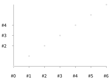
We started to work a bit on that direction. Consider the following example:
-=-=-=-=-=-=-=-=-=-=-=-=-=-=-=-= b := RTGrapher new.
ds := RTDataSet new. ds points: #(0 1 2 3 4 5 6). b add: ds.
deco := RTHorizontalAllValuesDecorator new. deco labelConversion: [ :value | '#', value asString ]. b addDecorator: deco.
deco := RTVerticalValuesDecorator new. deco addAll: #(2 3 4). deco labelConversion: [ :value | '#', value asString ]. b addDecorator: deco.
b axisX noTick; noLabel. b axisY noTick; noLabel. b -=-=-=-=-=-=-=-=-=-=-=-=-=-=-=-=
I suspect that in the future, the axis renderer will be much simpler with the decorator. Decorators gives flexibility.
Cheers, Alexandre
On Mar 24, 2015, at 9:00 AM, phil@highoctane.be wrote:
Le 23 mars 2015 18:58, "Alexandre Bergel" alexandre.bergel@me.com a écrit :
Hi!
You are using an histogram. I think I should disable having labels on the X-axis with histogram.
No, you shouldn't. I use that for dates. Well, I am going to use a decoration as you told me for my use case but this is the same. We need more control on where the labels are going.
Phil
Currently, you can have:
-=-=-=-=-=-=-=-=-=-=-=-=-=-=-= data := {1->0.3024011554432208. 2->24.359090088463624. 3->17.660001805380034. 4->12.111843293013179. 5->7.624345549738219. 6->5.985963170247337. 7->4.740250947824517. 8->3.837560931576097. 9->3.0691460552446292. 10->2.819777938256003. 11->2.3334536920021667. 12->1.9915598483480772. 13->1.6970572305470302. 14->1.3089005235602094. 15->1.1847806463260515. 16->1.0640458566528253. 17->0.8891496660046939. 18->0.7244087380393573. 19->0.670247337064452. 20->0.5878768730817837}.
y := [ :pair | (data select: [ :each | each key <= pair key ]) inject: 0 into: [:sum :item | sum + item value ]].
b := RTGrapher new. b extent: 500 @ 400.
ds := RTStackedDataSet new. ds points: data. ds histogramWithBarTitle: #key rotation: 0. ds y: y. ds barShape. ds highlightIf: [ :pair | true ] using: [ :pair | (y value: pair) roundTo: 1 ]. b add: ds.
ds := RTStackedDataSet new. ds connectColor: Color green. ds points: data. ds connectColor: Color green. ds y: y. b add: ds.
b axisX noLabel; noTick; title: 'method size (LOC)'. b axisY noDecimal; title: '% share'. b build.
lb := RTLegendBuilder new. lb view: b view. lb addColor: Color green text: 'Method size distribution'. lb build.
b view
No tick and no label on the X-axis. However, you titled bar in your stacked data set.
If you are working with distribution, I highly suggest you to work with RTDistribution. This class is far from being finished. But I need help on this. You can then do:
((CompiledMethod allInstances copyFrom: 1 to: 100) collect: #numberOfLinesOfCode) plotFrequency
Which produces something like:
So yes, most methods are very short :-)
Let us know how it goes
Cheers, Alexandre -- _,.;:~^~:;._,.;:~^~:;._,.;:~^~:;._,.;:~^~:;._,.;: Alexandre Bergel http://www.bergel.eu ^~:;._,.;:~^~:;._,.;:~^~:;._,.;:~^~:;._,.;:~^~:;.
On Mar 20, 2015, at 9:01 PM, Peter Uhnák i.uhnak@gmail.com wrote:
Hi!
Seeing your other (Grapher charting engine) post I wanted to look at it and it looks interesting. :)
However I've encountered weird behavior - maybe because I'm not using in correctly.
When you look at the bar chars they do not line up with the tick numbers at bottom. <2015-03-21_00:54:28.png> I have explicitly specified number of ticks (20). Interestingly if I change it (to 30) then it lines up but is moved to left by one (starts at zero instead of one - just by changing numberOfTicks).
<2015-03-21_00:55:23.png>
Here is the script I used to create it (the data is generated from another script)
data := {1->0.3024011554432208. 2->24.359090088463624. 3->17.660001805380034. 4->12.111843293013179. 5->7.624345549738219. 6->5.985963170247337. 7->4.740250947824517. 8->3.837560931576097. 9->3.0691460552446292. 10->2.819777938256003. 11->2.3334536920021667. 12->1.9915598483480772. 13->1.6970572305470302. 14->1.3089005235602094. 15->1.1847806463260515. 16->1.0640458566528253. 17->0.8891496660046939. 18->0.7244087380393573. 19->0.670247337064452. 20->0.5878768730817837}.
y := [ :pair | (data select: [ :each | each key <= pair key ]) inject: 0 into: [:sum :item | sum + item value ]].
b := RTGrapher new. b extent: 500 @ 400.
ds := RTStackedDataSet new. ds points: data. ds x: #key. ds y: y. ds barShape. b add: ds.
ds2 := RTStackedDataSet new. ds2 points: data. ds2 x: #key. ds2 y: y. ds2 connectColor: Color green. ds2 highlightIf: [ :pair | true ] using: [ :pair | (y value: pair) roundTo: 1 ]. b add: ds2.
b axisX noDecimal; numberOfTicks: 20; "<- change to 30 to break it" title: 'method size (LOC)'. b axisY noDecimal; title: '% share'. b build.
lb := RTLegendBuilder new. lb view: b view. lb addColor: Color green text: 'Method size distribution'. lb build.
b view open.
It's also amazing that 1/4 of all Pharo code is in two-line methods; that's including the method name. :)
Peter _______________________________________________ Moose-dev mailing list Moose-dev@iam.unibe.ch https://www.iam.unibe.ch/mailman/listinfo/moose-dev
Moose-dev mailing list Moose-dev@iam.unibe.ch https://www.iam.unibe.ch/mailman/listinfo/moose-dev
Moose-dev mailing list Moose-dev@iam.unibe.ch https://www.iam.unibe.ch/mailman/listinfo/moose-dev
Le 24 mars 2015 23:18, "Alexandre Bergel" alexandre.bergel@me.com a écrit :
Hi Phil,
We started to work a bit on that direction. Consider the following
example:
-=-=-=-=-=-=-=-=-=-=-=-=-=-=-=-= b := RTGrapher new.
ds := RTDataSet new. ds points: #(0 1 2 3 4 5 6). b add: ds.
deco := RTHorizontalAllValuesDecorator new. deco labelConversion: [ :value | '#', value asString ]. b addDecorator: deco.
deco := RTVerticalValuesDecorator new. deco addAll: #(2 3 4). deco labelConversion: [ :value | '#', value asString ]. b addDecorator: deco.
b axisX noTick; noLabel. b axisY noTick; noLabel. b -=-=-=-=-=-=-=-=-=-=-=-=-=-=-=-=
I suspect that in the future, the axis renderer will be much simpler with
the decorator. Decorators gives flexibility.
Super.
I also now have an HTML5 exporter version of mine thay exports nicely in a seaside component.
But the full view is draggable around and takes a lot of space despite the extent I specify for the RTGrapher.
Something in the Visitor maybe.
Phil
Cheers, Alexandre
On Mar 24, 2015, at 9:00 AM, phil@highoctane.be wrote:
Le 23 mars 2015 18:58, "Alexandre Bergel" alexandre.bergel@me.com a
écrit :
Hi!
You are using an histogram. I think I should disable having labels on
the X-axis with histogram.
No, you shouldn't. I use that for dates. Well, I am going to use a decoration as you told me for my use case but
this is the same.
We need more control on where the labels are going.
Phil
Currently, you can have:
-=-=-=-=-=-=-=-=-=-=-=-=-=-=-= data := {1->0.3024011554432208. 2->24.359090088463624.
3->17.660001805380034. 4->12.111843293013179. 5->7.624345549738219. 6->5.985963170247337. 7->4.740250947824517. 8->3.837560931576097. 9->3.0691460552446292. 10->2.819777938256003. 11->2.3334536920021667. 12->1.9915598483480772. 13->1.6970572305470302. 14->1.3089005235602094. 15->1.1847806463260515. 16->1.0640458566528253. 17->0.8891496660046939. 18->0.7244087380393573. 19->0.670247337064452. 20->0.5878768730817837}.
y := [ :pair | (data select: [ :each | each key <= pair key ]) inject:
0 into: [:sum :item | sum + item value ]].
b := RTGrapher new. b extent: 500 @ 400.
ds := RTStackedDataSet new. ds points: data. ds histogramWithBarTitle: #key rotation: 0. ds y: y. ds barShape. ds highlightIf: [ :pair | true ] using: [ :pair | (y value: pair)
roundTo: 1 ].
b add: ds.
ds := RTStackedDataSet new. ds connectColor: Color green. ds points: data. ds connectColor: Color green. ds y: y. b add: ds.
b axisX noLabel; noTick; title: 'method size (LOC)'. b axisY noDecimal; title: '% share'. b build.
lb := RTLegendBuilder new. lb view: b view. lb addColor: Color green text: 'Method size distribution'. lb build.
b view
No tick and no label on the X-axis. However, you titled bar in your
stacked data set.
If you are working with distribution, I highly suggest you to work
with RTDistribution. This class is far from being finished. But I need help on this. You can then do:
((CompiledMethod allInstances copyFrom: 1 to: 100) collect:
#numberOfLinesOfCode) plotFrequency
Which produces something like:
So yes, most methods are very short :-)
Let us know how it goes
Cheers, Alexandre -- _,.;:~^~:;._,.;:~^~:;._,.;:~^~:;._,.;:~^~:;._,.;: Alexandre Bergel http://www.bergel.eu ^~:;._,.;:~^~:;._,.;:~^~:;._,.;:~^~:;._,.;:~^~:;.
On Mar 20, 2015, at 9:01 PM, Peter Uhnák i.uhnak@gmail.com wrote:
Hi!
Seeing your other (Grapher charting engine) post I wanted to look at
it and it looks interesting. :)
However I've encountered weird behavior - maybe because I'm not using
in correctly.
When you look at the bar chars they do not line up with the tick
numbers at bottom.
<2015-03-21_00:54:28.png> I have explicitly specified number of ticks (20). Interestingly if I
change it (to 30) then it lines up but is moved to left by one (starts at zero instead of one - just by changing numberOfTicks).
<2015-03-21_00:55:23.png>
Here is the script I used to create it (the data is generated from
another script)
================================ data := {1->0.3024011554432208. 2->24.359090088463624.
3->17.660001805380034. 4->12.111843293013179. 5->7.624345549738219. 6->5.985963170247337. 7->4.740250947824517. 8->3.837560931576097. 9->3.0691460552446292. 10->2.819777938256003. 11->2.3334536920021667. 12->1.9915598483480772. 13->1.6970572305470302. 14->1.3089005235602094. 15->1.1847806463260515. 16->1.0640458566528253. 17->0.8891496660046939. 18->0.7244087380393573. 19->0.670247337064452. 20->0.5878768730817837}.
y := [ :pair | (data select: [ :each | each key <= pair key ])
inject: 0 into: [:sum :item | sum + item value ]].
b := RTGrapher new. b extent: 500 @ 400.
ds := RTStackedDataSet new. ds points: data. ds x: #key. ds y: y. ds barShape. b add: ds.
ds2 := RTStackedDataSet new. ds2 points: data. ds2 x: #key. ds2 y: y. ds2 connectColor: Color green. ds2 highlightIf: [ :pair | true ] using: [ :pair | (y value: pair)
roundTo: 1 ].
b add: ds2.
b axisX noDecimal; numberOfTicks: 20; "<- change to 30 to break it" title: 'method size (LOC)'. b axisY noDecimal; title: '% share'. b build.
lb := RTLegendBuilder new. lb view: b view. lb addColor: Color green text: 'Method size distribution'. lb build.
b view open.
It's also amazing that 1/4 of all Pharo code is in two-line methods;
that's including the method name. :)
Peter _______________________________________________ Moose-dev mailing list Moose-dev@iam.unibe.ch https://www.iam.unibe.ch/mailman/listinfo/moose-dev
Moose-dev mailing list Moose-dev@iam.unibe.ch https://www.iam.unibe.ch/mailman/listinfo/moose-dev
Moose-dev mailing list Moose-dev@iam.unibe.ch https://www.iam.unibe.ch/mailman/listinfo/moose-dev
-- _,.;:~^~:;._,.;:~^~:;._,.;:~^~:;._,.;:~^~:;._,.;: Alexandre Bergel http://www.bergel.eu ^~:;._,.;:~^~:;._,.;:~^~:;._,.;:~^~:;._,.;:~^~:;.
Moose-dev mailing list Moose-dev@iam.unibe.ch https://www.iam.unibe.ch/mailman/listinfo/moose-dev
Yes, I think you can set this in the visitor
Alexandre
-
 Alexandre Bergel
 -
 Peter Uhnák
 -
 phil@highoctane.be
 -
 Thomas Brodt