
3 Dec
2011
3 Dec
'11
10:04 p.m.
Hi,
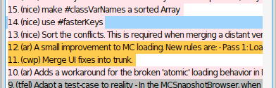
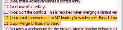
I started using #textBackgroundColor: which fits pretty good for my purposes as i don't want to overuse icons :) However, I think there is a conflict with the background color and the selected item color depending on the width of the panel. I attached two screenshots.
The first shows the selection of "14.....", here as the text is short it's easy to see that this item is selected. But in the second it's very complicate to appreciate that "13 ...." is my item of interest.
Is there a way to make the selection stronger?
Best regards, Veronica