
Hello,
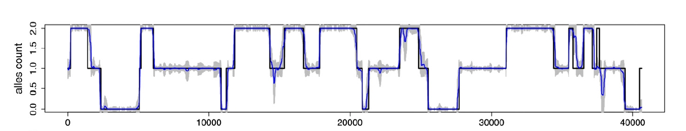
I am using Roassal2 (StephanEggermont.40) in Pharo 4. The attached picture displays a common visualization for inference of local ancestry in population genetics, I have attached what I am getting now with Grapher. Input data for such visualization is for example:
1:454 2:1488 1:2546 2:5711 1:14253 2:24411 1:31490 0:41585
(those are like Associations with key 0, 1 or 2 and value 454, 1488, ... etc)
In the attached picture
Min X is 0 and Max X is 41500
so the X axis (chromosome positions) is rendered in intervals between 10000.
This is what I am trying now (code is commented where I tried to configure X axis interval)
| b intv |
intv := 0 to: 40000 by: 10000. b := RTGrapher new.
ds := RTStackedDataSet new. ds dotShape color: Color red. ds points: #(1 2 1 2 1 2 1 0); x: intv. "????" ds barShape width: 99; color: Color red. "b minX: 0; maxX: 41500." b add: ds. b axisX noLabel; noTick. b axisY noDecimal. b build.
I have some questions:
1) There is support to add an interval label to the X axis but preserving the space relation with the real chromosome position (the X axis) for the data (points in my example = 454 1488 2546 5711 14253 24411 31490 41585)?
2) How to clear the bar filling?
Any advice or help would be really nice.
Hernán

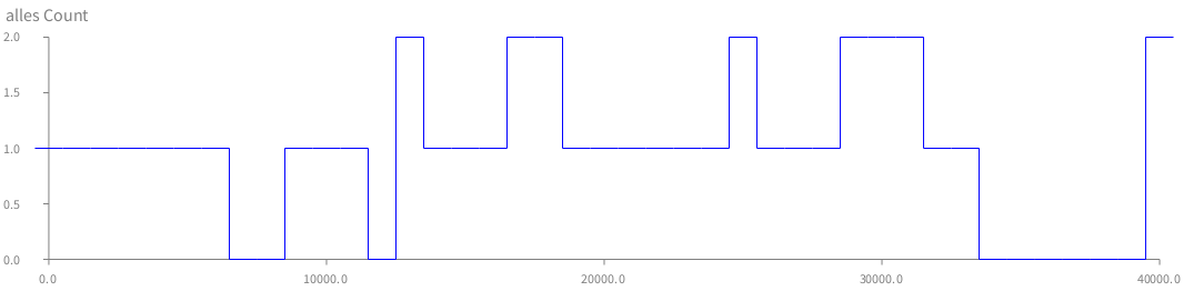
Hi Hernan
Try the next piece of code and tell me what you think
| b data |
data := (0 to: 40000 by: 1000) collect: [:n | n@ (Random new next * 3) floor]. b := RTGrapher new. b extent: 1000@ 200. ds := RTData new. ds dotShape rectangle height: 1; width: 25; color: Color blue. ds connectUsing: (RTLine new color: (Color blue); width: 1; withHorizontalAttachPoint; yourself). ds points: data; x: #x; y: #y.
b add: ds. b axisX. b axisY title: 'alles Count'. b build.
[image: Imágenes integradas 1]
Cheers, Milton
2015-11-18 17:15 GMT-04:00 Hernán Morales Durand hernan.morales@gmail.com:
Hello,
I am using Roassal2 (StephanEggermont.40) in Pharo 4. The attached picture displays a common visualization for inference of local ancestry in population genetics, I have attached what I am getting now with Grapher. Input data for such visualization is for example:
1:454 2:1488 1:2546 2:5711 1:14253 2:24411 1:31490 0:41585
(those are like Associations with key 0, 1 or 2 and value 454, 1488, ... etc)
In the attached picture
Min X is 0 and Max X is 41500
so the X axis (chromosome positions) is rendered in intervals between 10000.
This is what I am trying now (code is commented where I tried to configure X axis interval)
| b intv |
intv := 0 to: 40000 by: 10000. b := RTGrapher new.
ds := RTStackedDataSet new. ds dotShape color: Color red. ds points: #(1 2 1 2 1 2 1 0); x: intv. "????" ds barShape width: 99; color: Color red. "b minX: 0; maxX: 41500." b add: ds. b axisX noLabel; noTick. b axisY noDecimal. b build.
I have some questions:
- There is support to add an interval label to the X axis but preserving
the space relation with the real chromosome position (the X axis) for the data (points in my example = 454 1488 2546 5711 14253 24411 31490 41585)?
- How to clear the bar filling?
Any advice or help would be really nice.
Hernán
Moose-dev mailing list Moose-dev@list.inf.unibe.ch https://www.list.inf.unibe.ch/listinfo/moose-dev
Looks nice! :) I will try it my data set.
Thank you Milton.
2015-11-18 20:49 GMT-03:00 milton mamani akevalion@gmail.com:
Hi Hernan
Try the next piece of code and tell me what you think
| b data |
data := (0 to: 40000 by: 1000) collect: [:n | n@ (Random new next * 3) floor]. b := RTGrapher new. b extent: 1000@ 200. ds := RTData new. ds dotShape rectangle height: 1; width: 25; color: Color blue. ds connectUsing: (RTLine new color: (Color blue); width: 1; withHorizontalAttachPoint; yourself). ds points: data; x: #x; y: #y.
b add: ds. b axisX. b axisY title: 'alles Count'. b build.
[image: Imágenes integradas 1]
Cheers, Milton
2015-11-18 17:15 GMT-04:00 Hernán Morales Durand <hernan.morales@gmail.com
:
Hello,
I am using Roassal2 (StephanEggermont.40) in Pharo 4. The attached picture displays a common visualization for inference of local ancestry in population genetics, I have attached what I am getting now with Grapher. Input data for such visualization is for example:
1:454 2:1488 1:2546 2:5711 1:14253 2:24411 1:31490 0:41585
(those are like Associations with key 0, 1 or 2 and value 454, 1488, ... etc)
In the attached picture
Min X is 0 and Max X is 41500
so the X axis (chromosome positions) is rendered in intervals between 10000.
This is what I am trying now (code is commented where I tried to configure X axis interval)
| b intv |
intv := 0 to: 40000 by: 10000. b := RTGrapher new.
ds := RTStackedDataSet new. ds dotShape color: Color red. ds points: #(1 2 1 2 1 2 1 0); x: intv. "????" ds barShape width: 99; color: Color red. "b minX: 0; maxX: 41500." b add: ds. b axisX noLabel; noTick. b axisY noDecimal. b build.
I have some questions:
- There is support to add an interval label to the X axis but preserving
the space relation with the real chromosome position (the X axis) for the data (points in my example = 454 1488 2546 5711 14253 24411 31490 41585)?
- How to clear the bar filling?
Any advice or help would be really nice.
Hernán
Moose-dev mailing list Moose-dev@list.inf.unibe.ch https://www.list.inf.unibe.ch/listinfo/moose-dev
Moose-dev mailing list Moose-dev@list.inf.unibe.ch https://www.list.inf.unibe.ch/listinfo/moose-dev
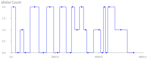
Hi again,
Probably it's me but with my real data I cannot find an easy way to set the extent in such way breakpoint lines are displayed vertically but not sloped. Do you know what I'm missing?
| b data dataSet dataPoints win alleleCount breakPoints |
win := '11:85 00:301 01:493 00:639 11:1063 00:1458 11:1754 00:2110 11:2299 00:2705 11:2786 01:2998 11:3213 01:3388 00:3495 01:4004 00:4156 11:4249 00:4339 11:4462 01:4997 00:5585' lines.
dataPoints := (win first findTokens: Character space) collect: [ : dp | dp findTokens: $: ]. breakPoints := (dataPoints collect: #second) collect: #asNumber. alleleCount := dataPoints collect: [ : a | a first = '11' ifTrue: [ 2 ] ifFalse: [ a first = '01' ifTrue: [ 1 ] ifFalse: [ 0 ] ] ].
data := breakPoints with: alleleCount collect: [ : bp : ac | bp @ ac ]. b := RTGrapher new. b extent: 570 @ 200. dataSet := RTDataSet new. dataSet dotShape rectangle height: 1; width: 25; color: Color blue. dataSet connectUsing: (RTLine new color: (Color blue); width: 1; withHorizontalAttachPoint; yourself). dataSet points: data; x: #x; y: #y. b add: dataSet. b axisX. b axisY title: 'alleles Count'. b build.
Hernán
2015-11-18 21:48 GMT-03:00 Hernán Morales Durand hernan.morales@gmail.com:
Looks nice! :) I will try it my data set.
Thank you Milton.
2015-11-18 20:49 GMT-03:00 milton mamani akevalion@gmail.com:
Hi Hernan
Try the next piece of code and tell me what you think
| b data |
data := (0 to: 40000 by: 1000) collect: [:n | n@ (Random new next * 3) floor]. b := RTGrapher new. b extent: 1000@ 200. ds := RTData new. ds dotShape rectangle height: 1; width: 25; color: Color blue. ds connectUsing: (RTLine new color: (Color blue); width: 1; withHorizontalAttachPoint; yourself). ds points: data; x: #x; y: #y.
b add: ds. b axisX. b axisY title: 'alles Count'. b build.
[image: Imágenes integradas 1]
Cheers, Milton
2015-11-18 17:15 GMT-04:00 Hernán Morales Durand < hernan.morales@gmail.com>:
Hello,
I am using Roassal2 (StephanEggermont.40) in Pharo 4. The attached picture displays a common visualization for inference of local ancestry in population genetics, I have attached what I am getting now with Grapher. Input data for such visualization is for example:
1:454 2:1488 1:2546 2:5711 1:14253 2:24411 1:31490 0:41585
(those are like Associations with key 0, 1 or 2 and value 454, 1488, ... etc)
In the attached picture
Min X is 0 and Max X is 41500
so the X axis (chromosome positions) is rendered in intervals between 10000.
This is what I am trying now (code is commented where I tried to configure X axis interval)
| b intv |
intv := 0 to: 40000 by: 10000. b := RTGrapher new.
ds := RTStackedDataSet new. ds dotShape color: Color red. ds points: #(1 2 1 2 1 2 1 0); x: intv. "????" ds barShape width: 99; color: Color red. "b minX: 0; maxX: 41500." b add: ds. b axisX noLabel; noTick. b axisY noDecimal. b build.
I have some questions:
- There is support to add an interval label to the X axis but
preserving the space relation with the real chromosome position (the X axis) for the data (points in my example = 454 1488 2546 5711 14253 24411 31490 41585)?
- How to clear the bar filling?
Any advice or help would be really nice.
Hernán
Moose-dev mailing list Moose-dev@list.inf.unibe.ch https://www.list.inf.unibe.ch/listinfo/moose-dev
Moose-dev mailing list Moose-dev@list.inf.unibe.ch https://www.list.inf.unibe.ch/listinfo/moose-dev

Why do you need a width for the dot?
You can do:
win := '11:85 00:301 01:493 00:639 11:1063 00:1458 11:1754 00:2110 11:2299 00:2705 11:2786 01:2998 11:3213 01:3388 00:3495 01:4004 00:4156 11:4249 00:4339 11:4462 01:4997 00:5585' lines.
dataPoints := (win first findTokens: Character space) collect: [ : dp | dp findTokens: $: ]. breakPoints := (dataPoints collect: #second) collect: #asNumber. alleleCount := dataPoints collect: [ : a | a first = '11' ifTrue: [ 2 ] ifFalse: [ a first = '01' ifTrue: [ 1 ] ifFalse: [ 0 ] ] ].
data := breakPoints with: alleleCount collect: [ : bp : ac | bp @ ac ]. b := RTGrapher new. b extent: 570 @ 200. dataSet := RTDataSet new. dataSet dotShape color: Color blue. dataSet connectUsing: ((RTMultiLine new withVerticallAttachPoint; orthoHorizontal) color: (Color blue); width: 1; withHorizontalAttachPoint; yourself). dataSet points: data; x: #x; y: #y. b add: dataSet. b axisX. b axisY title: 'alleles Count'. b build.
Cheers, Alexandre
2015-11-24 9:14 GMT-03:00 Alexandre Bergel alexandre.bergel@me.com:
Why do you need a width for the dot?
Ahá! I didn't checked rectangle and multiline, I need more practice with Roassal API :) Thank you Alex,
Hernán
You can do:
win := '11:85 00:301 01:493 00:639 11:1063 00:1458 11:1754 00:2110 11:2299 00:2705 11:2786 01:2998 11:3213 01:3388 00:3495 01:4004 00:4156 11:4249 00:4339 11:4462 01:4997 00:5585' lines.
dataPoints := (win first findTokens: Character space) collect: [ : dp | dp findTokens: $: ]. breakPoints := (dataPoints collect: #second) collect: #asNumber. alleleCount := dataPoints collect: [ : a | a first = '11' ifTrue: [ 2 ] ifFalse: [ a first = '01' ifTrue: [ 1 ] ifFalse: [ 0 ] ] ].
data := breakPoints with: alleleCount collect: [ : bp : ac | bp @ ac ]. b := RTGrapher new. b extent: 570 @ 200. dataSet := RTDataSet new. dataSet dotShape color: Color blue. dataSet connectUsing: ((RTMultiLine new withVerticallAttachPoint; orthoHorizontal) color: (Color blue); width: 1; withHorizontalAttachPoint; yourself). dataSet points: data; x: #x; y: #y. b add: dataSet. b axisX. b axisY title: 'alleles Count'. b build.
Cheers, Alexandre -- _,.;:~^~:;._,.;:~^~:;._,.;:~^~:;._,.;:~^~:;._,.;: Alexandre Bergel http://www.bergel.eu ^~:;._,.;:~^~:;._,.;:~^~:;._,.;:~^~:;._,.;:~^~:;.
On Nov 23, 2015, at 3:28 PM, Hernán Morales Durand < hernan.morales@gmail.com> wrote:
Hi again,
Probably it's me but with my real data I cannot find an easy way to set the extent in such way breakpoint lines are displayed vertically but not sloped. Do you know what I'm missing?
| b data dataSet dataPoints win alleleCount breakPoints |
win := '11:85 00:301 01:493 00:639 11:1063 00:1458 11:1754 00:2110 11:2299 00:2705 11:2786 01:2998 11:3213 01:3388 00:3495 01:4004 00:4156 11:4249 00:4339 11:4462 01:4997 00:5585' lines.
dataPoints := (win first findTokens: Character space) collect: [ : dp | dp findTokens: $: ]. breakPoints := (dataPoints collect: #second) collect: #asNumber. alleleCount := dataPoints collect: [ : a | a first = '11' ifTrue: [ 2 ] ifFalse: [ a first = '01' ifTrue: [ 1 ] ifFalse: [ 0 ] ] ].
data := breakPoints with: alleleCount collect: [ : bp : ac | bp @ ac ]. b := RTGrapher new. b extent: 570 @ 200. dataSet := RTDataSet new. dataSet dotShape rectangle height: 1; width: 25; color: Color blue. dataSet connectUsing: (RTLine new color: (Color blue); width: 1; withHorizontalAttachPoint; yourself). dataSet points: data; x: #x; y: #y. b add: dataSet. b axisX. b axisY title: 'alleles Count'. b build.
Hernán
2015-11-18 21:48 GMT-03:00 Hernán Morales Durand <hernan.morales@gmail.com
:
Looks nice! :) I will try it my data set.
Thank you Milton.
2015-11-18 20:49 GMT-03:00 milton mamani akevalion@gmail.com:
Hi Hernan
Try the next piece of code and tell me what you think
| b data |
data := (0 to: 40000 by: 1000) collect: [:n | n@ (Random new next * 3) floor]. b := RTGrapher new. b extent: 1000@ 200. ds := RTData new. ds dotShape rectangle height: 1; width: 25; color: Color blue. ds connectUsing: (RTLine new color: (Color blue); width: 1; withHorizontalAttachPoint; yourself). ds points: data; x: #x; y: #y.
b add: ds. b axisX. b axisY title: 'alles Count'. b build.
<foo.png>
Cheers, Milton
2015-11-18 17:15 GMT-04:00 Hernán Morales Durand < hernan.morales@gmail.com>:
Hello,
I am using Roassal2 (StephanEggermont.40) in Pharo 4. The attached picture displays a common visualization for inference of local ancestry in population genetics, I have attached what I am getting now with Grapher. Input data for such visualization is for example:
1:454 2:1488 1:2546 2:5711 1:14253 2:24411 1:31490 0:41585
(those are like Associations with key 0, 1 or 2 and value 454, 1488, ... etc)
In the attached picture
Min X is 0 and Max X is 41500
so the X axis (chromosome positions) is rendered in intervals between 10000.
This is what I am trying now (code is commented where I tried to configure X axis interval)
| b intv |
intv := 0 to: 40000 by: 10000. b := RTGrapher new.
ds := RTStackedDataSet new. ds dotShape color: Color red. ds points: #(1 2 1 2 1 2 1 0); x: intv. "????" ds barShape width: 99; color: Color red. "b minX: 0; maxX: 41500." b add: ds. b axisX noLabel; noTick. b axisY noDecimal. b build.
I have some questions:
- There is support to add an interval label to the X axis but
preserving the space relation with the real chromosome position (the X axis) for the data (points in my example = 454 1488 2546 5711 14253 24411 31490 41585)?
- How to clear the bar filling?
Any advice or help would be really nice.
Hernán
Moose-dev mailing list Moose-dev@list.inf.unibe.ch https://www.list.inf.unibe.ch/listinfo/moose-dev
Moose-dev mailing list Moose-dev@list.inf.unibe.ch https://www.list.inf.unibe.ch/listinfo/moose-dev
Moose-dev mailing list Moose-dev@list.inf.unibe.ch https://www.list.inf.unibe.ch/listinfo/moose-dev
Moose-dev mailing list Moose-dev@list.inf.unibe.ch https://www.list.inf.unibe.ch/listinfo/moose-dev
Excellent example! I have added it in Roassal
Alexandre
Don’t you want to consider in moving to the last version of Roassal?
Alexandre
Hi Alex,
Yes but I just installed the version available in the Configuration Browser. I thought it was the latest one, but then I've checked in Pharo 5 the Catalog Browser seems to install another more updated version.
Cheers,
Hernán
2015-11-19 9:31 GMT-03:00 Alexandre Bergel alexandre.bergel@me.com:
Don’t you want to consider in moving to the last version of Roassal?
Alexandre
_,.;:~^~:;._,.;:~^~:;._,.;:~^~:;._,.;:~^~:;._,.;: Alexandre Bergel http://www.bergel.eu ^~:;._,.;:~^~:;._,.;:~^~:;._,.;:~^~:;._,.;:~^~:;.
On Nov 18, 2015, at 6:15 PM, Hernán Morales Durand < hernan.morales@gmail.com> wrote:
Hello,
I am using Roassal2 (StephanEggermont.40) in Pharo 4. The attached picture displays a common visualization for inference of local ancestry in population genetics, I have attached what I am getting now with Grapher. Input data for such visualization is for example:
1:454 2:1488 1:2546 2:5711 1:14253 2:24411 1:31490 0:41585
(those are like Associations with key 0, 1 or 2 and value 454, 1488, ... etc)
In the attached picture
Min X is 0 and Max X is 41500
so the X axis (chromosome positions) is rendered in intervals between 10000.
This is what I am trying now (code is commented where I tried to configure X axis interval)
| b intv |
intv := 0 to: 40000 by: 10000. b := RTGrapher new.
ds := RTStackedDataSet new. ds dotShape color: Color red. ds points: #(1 2 1 2 1 2 1 0); x: intv. "????" ds barShape width: 99; color: Color red. "b minX: 0; maxX: 41500." b add: ds. b axisX noLabel; noTick. b axisY noDecimal. b build.
I have some questions:
- There is support to add an interval label to the X axis but preserving
the space relation with the real chromosome position (the X axis) for the data (points in my example = 454 1488 2546 5711 14253 24411 31490 41585)?
- How to clear the bar filling?
Any advice or help would be really nice.
Hernán
<LocalAncestry.jpg><Grapher_Test1.png> _______________________________________________ Moose-dev mailing list Moose-dev@list.inf.unibe.ch https://www.list.inf.unibe.ch/listinfo/moose-dev
Moose-dev mailing list Moose-dev@list.inf.unibe.ch https://www.list.inf.unibe.ch/listinfo/moose-dev
Ah okay. Yes, version for Pharo 4 is not maintained at all.
Cheers, Alexandre
-
 Alexandre Bergel
 -
 Hernán Morales Durand
 -
 milton mamani