
26 Jan
2009
26 Jan
'09
10:14 a.m.
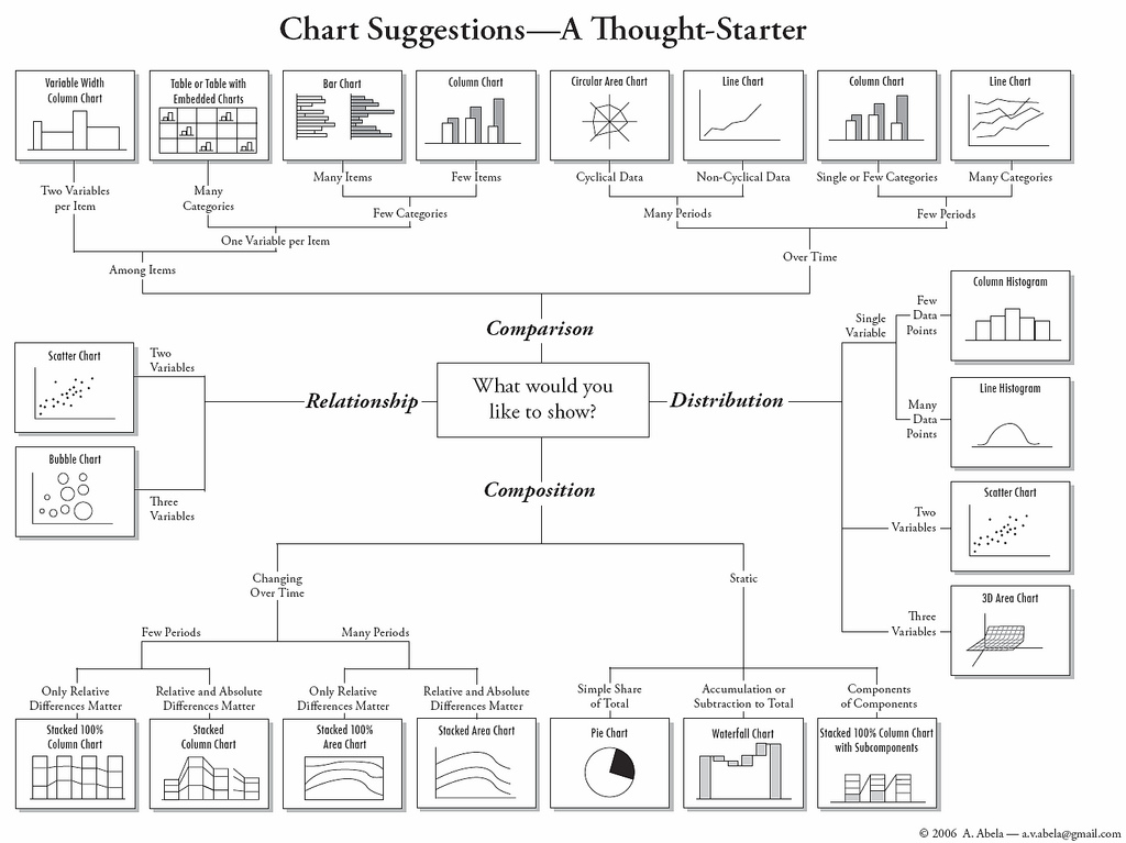
I just stumbled across the following chart that I found to be a nice overview as well:
On 22 Jan 2009, at 17:49, Alexandre Bergel wrote:
This visualization was recommended by some industrials:
http://www.nytimes.com/packages/khtml/2006/04/02/business/20060402_SECTOR_GR...
Cheers, Alexandre -- _,.;:~^~:;._,.;:~^~:;._,.;:~^~:;._,.;:~^~:;._,.;: Alexandre Bergel http://www.bergel.eu ^~:;._,.;:~^~:;._,.;:~^~:;._,.;:~^~:;._,.;:~^~:;.
Moose-dev mailing list Moose-dev@iam.unibe.ch https://www.iam.unibe.ch/mailman/listinfo/moose-dev
---------------------------- Johan Brichau johan.brichau@uclouvain.be