
On Tue, May 8, 2012 at 3:18 PM, Andre Hora andrehoraa@gmail.com wrote:
Hi,
[cut]
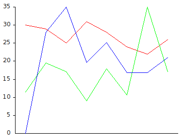
model1 := #(30 29 25 31 28 24 22 26). model2 := #(14 24 21 11 22 13 43 21). model3 := #(0 20 25 14 18 12 12 15).
[cut]
diag2 := (ESDiagramRenderer new lineDiagram) y: #yourself; defaultColor: Color green; models: model2; yourself.
diag3 := (ESDiagramRenderer new lineDiagram) y: #yourself; defaultColor: Color blue; models: model3; yourself.
[snip]
Careful with this! the labels only apply to the first data set (the red one) - if you look at the second data set where the max value is 43, you'll notice it corresponds to 35 in the diagram; and if you look at the third data set (blue) with a max value of 25, you'll also not that this corresponds to 35 in the diagram.
So, each data set is scaled to fit on the diagram, but doesn't change the range... -Chris