
Hi Alexandre, this is close. It at least mirrors what I could get elsewhere (with work).
What I'd really like is: 1. To just have the DATE shown on the X axis (easy to do) 2. To have the bars be places on the X axis relative to where they would be in a timeline. Harder to do - maybe need to make the values based on minutes since first value? or beginning of first day? I think I might see this - but previous examples seem to use scatter type plots - and not histograms. (Hmm, figured it out!) 3. To have the bars be skinny enough (when needed) to show the close times.
If you look at the data, the gray and green bars are all 1 day apart from each other. The RED one is 1/2 hour after the second gray one - it would be nice to show them that close together.
This code gets close - just need to shape the bars reasonably (the second gray bar is almost completely hidden):
-=-=-=-=-=-=-=-=-=-=-=-= data := { Dictionary new at: 'COLOR' put: Color gray; at: 'TIME' put: (DateAndTime fromString: '2014-10-30 12:11:28.0'); at: 'SECONDS' put: 4; yourself. Dictionary new at: 'COLOR' put: Color gray; at: 'TIME' put: (DateAndTime fromString: '2014-10-31 12:11:28.0'); at: 'SECONDS' put: 5; yourself. Dictionary new at: 'COLOR' put: Color red; at: 'TIME' put: (DateAndTime fromString: '2014-10-31 12:41:28.0'); at: 'SECONDS' put: 15; yourself. Dictionary new at: 'COLOR' put: Color green; at: 'TIME' put: (DateAndTime fromString: '2014-11-01 12:11:28.0'); at: 'SECONDS' put: 7; yourself. Dictionary new at: 'COLOR' put: Color gray; at: 'TIME' put: (DateAndTime fromString: '2014-11-02 12:11:28.0'); at: 'SECONDS' put: 1; yourself. Dictionary new at: 'COLOR' put: Color gray; at: 'TIME' put: (DateAndTime fromString: '2014-11-03 12:11:28.0'); at: 'SECONDS' put: 4; yourself. }. b := RTCharterBuilder new. b extent: 300 @ 200. b shape rectangle size: 0. b points: data. b y: [ :entry | entry at: 'SECONDS' ]. firstDay := (data collect: [ :d| d at: 'TIME' ]) min. base := firstDay julianDayNumber. firstDay := (firstDay asDuration asMinutes) floor + (firstDay julianDayNumber * 1440). b allX: [ :v | ((v at: 'TIME') asDuration asMinutes) floor + ((v at: 'TIME') julianDayNumber * 1440) - firstDay ].
b shape rectangle color: [ :entry | entry at: 'COLOR' ].
b interaction highlightColored: Color red. b histogramWithBarTitle: [ :entry | '' ].
b axisY. "b newAxisConfiguration plain." b axisConfiguration title: ''; labelRotation: -30; numberOfTicks: 4; numberOfLabels: 4; labelConvertion: [ :v | Transcript show: v asString; cr. Date julianDayNumber: (v / 1440) rounded + base ]. b axisX. b build. b view -=-=-=-=-=-=-=-=-=-=-=-= [image: Inline image 1]
On Tue, Nov 4, 2014 at 2:17 PM, Alexandre Bergel alexandre.bergel@me.com wrote:
Hi Chris!
A first and quick try of your data gave me:
-=-=-=-=-=-=-=-=-=-=-=-= data := { Dictionary new at: 'COLOR' put: Color gray; at: 'TIME' put: (DateAndTime fromString: '2014-10-30 12:11:28.0'); at: 'SECONDS' put: 4; yourself. Dictionary new at: 'COLOR' put: Color gray; at: 'TIME' put: (DateAndTime fromString: '2014-10-31 12:11:28.0'); at: 'SECONDS' put: 5; yourself. Dictionary new at: 'COLOR' put: Color red; at: 'TIME' put: (DateAndTime fromString: '2014-10-31 12:41:28.0'); at: 'SECONDS' put: 15; yourself. Dictionary new at: 'COLOR' put: Color green; at: 'TIME' put: (DateAndTime fromString: '2014-11-01 12:11:28.0'); at: 'SECONDS' put: 7; yourself. Dictionary new at: 'COLOR' put: Color gray; at: 'TIME' put: (DateAndTime fromString: '2014-11-02 12:11:28.0'); at: 'SECONDS' put: 1; yourself. Dictionary new at: 'COLOR' put: Color gray; at: 'TIME' put: (DateAndTime fromString: '2014-11-03 12:11:28.0'); at: 'SECONDS' put: 4; yourself. }. b := RTCharterBuilder new. b extent: 300 @ 200. b shape rectangle size: 0. b points: data. b y: [ :entry | entry at: 'SECONDS' ]. b stackX. b shape rectangle color: [ :entry | entry at: 'COLOR' ].
b interaction highlightColored: Color red. b histogramWithBarTitle: [ :entry | entry at: 'TIME' ].
b axisY. b newAxisConfiguration plain. b axisX. b build. b view -=-=-=-=-=-=-=-=-=-=-=-=
Is this what you expect?
Cheers, Alexandre -- _,.;:~^~:;._,.;:~^~:;._,.;:~^~:;._,.;:~^~:;._,.;: Alexandre Bergel http://www.bergel.eu ^~:;._,.;:~^~:;._,.;:~^~:;._,.;:~^~:;._,.;:~^~:;.
On Nov 4, 2014, at 5:41 PM, Chris Cunningham cunningham.cb@gmail.com wrote:
I am currently using EyeSee for doing some charting/graphing, and am running into some of its limitations. I'd like to use the newest/bestest, but am stumped how to use it right now.
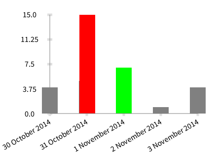
Attached is roughly the graph I want:<image.png> except I'd like the bars to be located correctly for the time (as well as the labels). Or, even better, be able to state that I want the days labelled, and either hour tick marks, or optional tick marks. And, of course, be able to specifically call out the color of the bars.
Data to build this chart: x := { Dictionary new at: 'COLOR' put: Color gray; at: 'TIME' put: (DateAndTime fromString: '2014-10-30 12:11:28.0'); at: 'SECONDS' put: 4; yourself. Dictionary new at: 'COLOR' put: Color gray; at: 'TIME' put: (DateAndTime fromString: '2014-10-31 12:11:28.0'); at: 'SECONDS' put: 5; yourself. Dictionary new at: 'COLOR' put: Color red; at: 'TIME' put: (DateAndTime fromString: '2014-10-31 12:41:28.0'); at: 'SECONDS' put: 15; yourself. Dictionary new at: 'COLOR' put: Color green; at: 'TIME' put: (DateAndTime fromString: '2014-11-01 12:11:28.0'); at: 'SECONDS' put: 7; yourself. Dictionary new at: 'COLOR' put: Color gray; at: 'TIME' put: (DateAndTime fromString: '2014-11-02 12:11:28.0'); at: 'SECONDS' put: 1; yourself. Dictionary new at: 'COLOR' put: Color gray; at: 'TIME' put: (DateAndTime fromString: '2014-11-03 12:11:28.0'); at: 'SECONDS' put: 4; yourself. }.
-cbc _______________________________________________ Moose-dev mailing list Moose-dev@iam.unibe.ch https://www.iam.unibe.ch/mailman/listinfo/moose-dev
Moose-dev mailing list Moose-dev@iam.unibe.ch https://www.iam.unibe.ch/mailman/listinfo/moose-dev