
Hi Thomas,
Mixing both stacked and non-stacked data is a bit odd. I am not sure how other charting engine behaves on this. We will have to check.
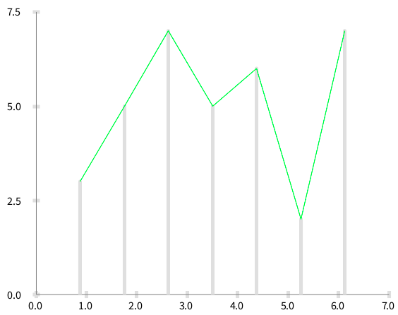
A stacked data set may be rendered using lines instead of bar charts. Consider: -=-=-=-=-=-=-=-=-=-= data1 := #(3 5 7 5 6 2 7).
ds1 := RTStackedDataSet new. ds1 points: data1. ds1 barShape.
ds2 := RTStackedDataSet new. ds2 connectColor: Color green. ds2 points: data1.
b := RTGrapher new. b extent: 500 @ 400. b add: ds1. b add: ds2.
b axisX numberOfTicks: 7; numberOfLabels: 7.
b build. b view open -=-=-=-=-=-=-=-=-=-=
It produces
Is this close to what you want to achieve?
Cheers, Alexandre
On Mar 24, 2015, at 6:25 AM, Thomas Brodt thomas.brodt.lists@porabo.ch wrote:
I also already noticed that Barcharts currently do not use the index in the collections as x value, but a distribution over the x axis between (x-1) and x. This leads to misalignment when you compose two DataSets like this:
================================ data1 := #(3 5 7 5 6 2 7). data2 := Array with: 1 @ 3 with: 3 @ 5 with: 7 @2. ds1 := RTStackedDataSet new. ds1 points: data1. ds1 barShape. ds2 := RTDataSet new. ds2 connectColor: Roassal2.Color green. ds2 x: #x; y: #y. ds2 points: data2. b := RTGrapher new. b extent: 500 @ 400. b add: ds1. b add: ds2. b axisX numberOfTicks: 7; numberOfLabels: 7. b build. b view open ================================
As a rough bug fix I made another subclass RTBarChartDataSet that uses the real index. The following script just uses RTBarChartDataSet instead of RTStackedDataSet. Be aware that the fileout is from Visualworks, not Pharo.
================================ data1 := #(3 5 7 5 6 2 7). data2 := Array with: 1 @ 3 with: 3 @ 5 with: 7 @2.
ds1 := RTBarChartDataSet new. ds1 points: data1. ds1 barShape.
ds2 := RTDataSet new. ds2 connectColor: Roassal2.Color green. ds2 x: #x; y: #y. ds2 points: data2.
b := RTGrapher new. b extent: 500 @ 400. b add: ds1. b add: ds2.
b axisX numberOfTicks: 7; numberOfLabels: 7. b build.
b view open
Now the points align. There are other issues however, e.g. the x axis currently stops at max value, but should be at least as wide as the bar covers the x axis. But as a first sketch, it solved our issue.
Maybe this can inspire someone to a real solution to have barcharts whose x value corresponds to the values, not only the index in a collection (we will need this somewhen, anyway).
Thomas
Am 23.03.2015 um 18:58 schrieb Alexandre Bergel:
Hi!
You are using an histogram. I think I should disable having labels on the X-axis with histogram. Currently, you can have:
-=-=-=-=-=-=-=-=-=-=-=-=-=-=-= data := {1->0.3024011554432208. 2->24.359090088463624. 3->17.660001805380034. 4->12.111843293013179. 5->7.624345549738219. 6->5.985963170247337. 7->4.740250947824517. 8->3.837560931576097. 9->3.0691460552446292. 10->2.819777938256003. 11->2.3334536920021667. 12->1.9915598483480772. 13->1.6970572305470302. 14->1.3089005235602094. 15->1.1847806463260515. 16->1.0640458566528253. 17->0.8891496660046939. 18->0.7244087380393573. 19->0.670247337064452. 20->0.5878768730817837}.
y := [ :pair | (data select: [ :each | each key <= pair key ]) inject: 0 into: [:sum :item | sum + item value ]].
b := RTGrapher new. b extent: 500 @ 400.
ds := RTStackedDataSet new. ds points: data. ds histogramWithBarTitle: #key rotation: 0. ds y: y. ds barShape. ds highlightIf: [ :pair | true ] using: [ :pair | (y value: pair) roundTo: 1 ]. b add: ds.
ds := RTStackedDataSet new. ds connectColor: Color green. ds points: data. ds connectColor: Color green. ds y: y. b add: ds.
b axisX noLabel; noTick; title: 'method size (LOC)'.
b axisY noDecimal; title: '% share'. b build.
lb := RTLegendBuilder new. lb view: b view. lb addColor: Color green text: 'Method size distribution'. lb build.
b view
No tick and no label on the X-axis. However, you titled bar in your stacked data set.
<Mail Attachment.png>
If you are working with distribution, I highly suggest you to work with RTDistribution. This class is far from being finished. But I need help on this. You can then do:
((CompiledMethod allInstances copyFrom: 1 to: 100) collect: #numberOfLinesOfCode) plotFrequency
Which produces something like:
<Mail Attachment.png>
So yes, most methods are very short :-)
Let us know how it goes
Cheers, Alexandre -- _,.;:~^~:;._,.;:~^~:;._,.;:~^~:;._,.;:~^~:;._,.;: Alexandre Bergel http://www.bergel.eu ^~:;._,.;:~^~:;._,.;:~^~:;._,.;:~^~:;._,.;:~^~:;.
On Mar 20, 2015, at 9:01 PM, Peter Uhnák i.uhnak@gmail.com wrote:
Hi!
Seeing your other (Grapher charting engine) post I wanted to look at it and it looks interesting. :)
However I've encountered weird behavior - maybe because I'm not using in correctly.
When you look at the bar chars they do not line up with the tick numbers at bottom. <2015-03-21_00:54:28.png> I have explicitly specified number of ticks (20). Interestingly if I change it (to 30) then it lines up but is moved to left by one (starts at zero instead of one - just by changing numberOfTicks).
<2015-03-21_00:55:23.png>
Here is the script I used to create it (the data is generated from another script)
data := {1->0.3024011554432208. 2->24.359090088463624. 3->17.660001805380034. 4->12.111843293013179. 5->7.624345549738219. 6->5.985963170247337. 7->4.740250947824517. 8->3.837560931576097. 9->3.0691460552446292. 10->2.819777938256003. 11->2.3334536920021667. 12->1.9915598483480772. 13->1.6970572305470302. 14->1.3089005235602094. 15->1.1847806463260515. 16->1.0640458566528253. 17->0.8891496660046939. 18->0.7244087380393573. 19->0.670247337064452. 20->0.5878768730817837}.
y := [ :pair | (data select: [ :each | each key <= pair key ]) inject: 0 into: [:sum :item | sum + item value ]].
b := RTGrapher new. b extent: 500 @ 400.
ds := RTStackedDataSet new. ds points: data. ds x: #key. ds y: y. ds barShape. b add: ds.
ds2 := RTStackedDataSet new. ds2 points: data. ds2 x: #key. ds2 y: y. ds2 connectColor: Color green. ds2 highlightIf: [ :pair | true ] using: [ :pair | (y value: pair) roundTo: 1 ]. b add: ds2.
b axisX
noDecimal;
numberOfTicks: 20; "<- change to 30 to break it"
title: 'method size (LOC)'.
b axisY
noDecimal;
title: '% share'. b build.
lb := RTLegendBuilder new. lb view: b view. lb addColor: Color green text: 'Method size distribution'. lb build.
b view open.
It's also amazing that 1/4 of all Pharo code is in two-line methods; that's including the method name. :)
Peter _______________________________________________ Moose-dev mailing list Moose-dev@iam.unibe.ch https://www.iam.unibe.ch/mailman/listinfo/moose-dev
Moose-dev mailing list
Moose-dev@iam.unibe.ch https://www.iam.unibe.ch/mailman/listinfo/moose-dev
<RTBarChartDataSet.st>_______________________________________________ Moose-dev mailing list Moose-dev@iam.unibe.ch https://www.iam.unibe.ch/mailman/listinfo/moose-dev